Lone
A downloadable game for Windows
Download NowName your own price
About
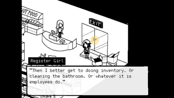
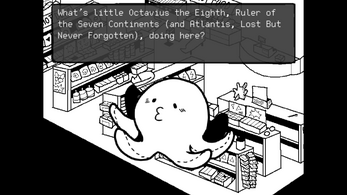
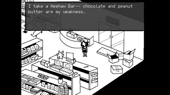
Discover the art of loneliness as you wander a mysterious gas station's convenience store.
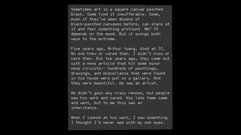
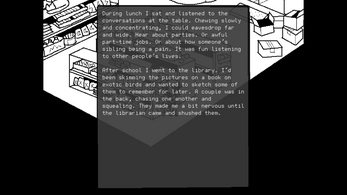
A text-heavy game with quirky dialogues and cute art. Takes < 20 minutes to complete. WASD + Space bar.
Creation
Created as a multimedia project for a creative writing class over a weekend and a Friday since it was due Monday morning. Made in Unity.
--
Thanks to:
Terry Nguyen - Art
David Chew - Music
| Status | Prototype |
| Platforms | Windows |
| Rating | Rated 5.0 out of 5 stars (3 total ratings) |
| Author | impuuuu |
| Genre | Visual Novel |
| Tags | 2D, Cute, Female Protagonist, Narrative, Pixel Art, Short, Singleplayer, Story Rich, Unity |
Download
Download NowName your own price
Click download now to get access to the following files:
Lone_Build.zip 21 MB
LoneStarGasStation script.pdf 76 kB
Comments
Log in with itch.io to leave a comment.
i saw your post on reddit and could tell this was going to be a beautiful experience. everything is done well and you can see the three voices - writer/designer, visual artist, and composer. my only "complaint" (compliment) is that i would like to see more from the musician and artist. the close-up drawings are especially cool, but i wanted more drawings for the other characters and items. but in general i love the simple and precise art, and like how the girl floats around. the music is perfect, again i just wanted more songs. like during the intro there could be a different score. i loved the unexpected "glitch in the matrix" vibe. and the unexpected poignancy.
That means a lot! You made my day. I forwarded your comment to the artist/musician as well! More art and music would be great, I kinda sprung this project on them both at the last minute so I'm very glad with what they were able to produce. If I revisit the game more I'll try to add more details to everything (:
they both did amazing jobs! i feel weird about my use of the word "precise" for the visual art, because compares to a lot of pixel art, it's more sketchy. but i meant precise in what it gets across to the player. all the necessary info is there and if no info is needed there's good abstraction. i also regret not praising the writing , i guess i didnt think to because it was so obviously good! great game
Loved the story part of this game. The music in the gas station fit really well. I liked the art for the gas station, but I think the scaling was a bit off so the image got a little warped, making it look less crisp in-engine than it really is. The font for the letters and such felt like it didn't really fit with the art style -- maybe a more pixelated font?
Would have been nice to have the character's sprite draw behind the gas station shelving. You could make the shelves their own objects and then linecast towards the player to determine the angle, then compare that with the angle that the shelve is at, then finally adjust the spriterenderer order in layer.
Thanks so much! It is a pixel font, but you think a smaller size pixel would be better? I'll look into the Unity settings to make the image more crisp. Is it like the pixel art is being aliased?
I've been trying to write some general code to layer sprite images but it's been quite difficult to get the math right haha
Actually just got layered movement working! So that build is up whoo.
I spent a few days trying to do it some weird way... which was defining a bunch of "bottom planes" for each object and automatically sorting the layers. That did not work and my brain hurts.
But the way that does work it easy! I just check for overlapping objects and stick her in the right layer. Whoo. sob. That took like 20 minutes compared to my first attempt.
Oh wow, that didn't even cross my mind as a possibility. My idea for it was pretty much the same as the one you first tried to do. I was actually writing up a reply on how to do that but saw you figured it out, so... awesome!
I think the issue I had with the font was actually an issue with Unity's text handling. The text is antialiased, which looks kinda weird in a non-antialiased game. I'm not sure how you can make it sharper with the base Unity text, but you could try TextMeshPro (on the asset store for free). As for sharpening up the image... I don't really know what the issue is, it feels like it's stretched in some strange way. Some pixels seem larger than others, etc. I don't know what your settings are for the image in Unity, but do you have the file format at 32 bit and the filter mode on point (no filter)? You could also try playing around with the pixels per unit.
Haha I would be interested actually if you thought of a generalized way to automatically sort all objects based on where they are. My solution requires setting sorting layers for all objects, which isn't the worst actually.
Hmm I don't see the stretching. I do have No Compression/Point Filter on my Sprites but didn't do any other game settings.
This is what it looks like on my screen. If you zoom in a bit, it looks like there is some sort of antialiasing going on.
Ooh that's actually probably because I forgot to set Point on some of them, thanks